

Trend analysis with topic drilldown und sentiment
What does the Topic Trend Analysis show?
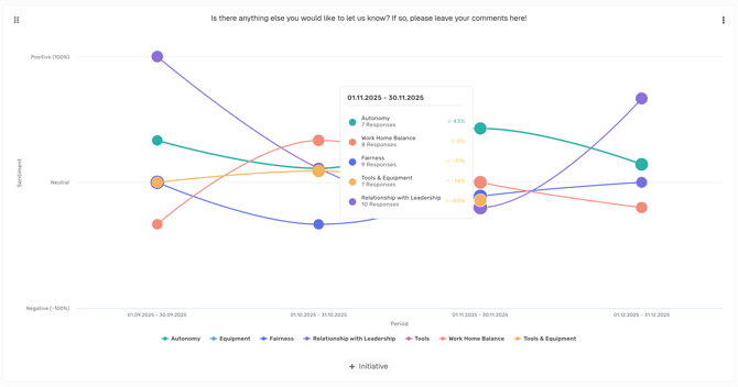
The Topic Trend Analysis is an interactive visualization that helps you see how sentiment for different topics changes over time —based on open-ended comments in surveys.- Bubble size → number of responses for the topic
- Bubble position (vertical) → sentiment (top = positive, middle = neutral, bottom = negative)
- Bubble progression over time → sentiment trend for each topic
At most, the 10 topics with the most comments within the selected time range are displayed.
How can I create this chart?
Creation (Admin/Manager/Analyst)-
In the side menu
 , first create your categories as explained here.
-
Go back to your dashboard
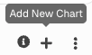
 and click on + (“Add new chart”).\
-
Select Topic Trend Analysis

- Now choose your questions – in this case, the open text fields that should be visualized as a Topic Trend Analysis.
-
Click “Save”.

After creation and for dashboard users (Admin/Manager/Analyst/Report Viewer)
- Open the Topic Trend Analysis in your dashboard.
- Hover over bubbles to see quick statistics.
-
Click on a bubble to drill down into individual employee responses.
- All available responses for that topic are shown.
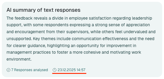
- An AI-Summary is shown.
- Responses are displayed according to user permissions and survey anonymity settings.
- Read the AI-generated summary atop the drilldown for a quick overview of the feedback included.
How up to date is the AI summary?
The AI summary of text responses is created the first time you open it and is then stored. If you open the same bubble again, you see the stored version.- Completed period: If the period has already ended, the summary is stored for 8 weeks. No new responses can be added to a period that has ended.
- Ongoing period: If the period ends in the future, the summary is stored for only 2 days. After that, it is created again the next time it is opened and then includes the responses received in the meantime.
- Personalized: Each person gets their own summary – in their language and based only on the responses they are allowed to see according to their permissions and the anonymity settings. Two people may therefore see different summaries for the same topic.
- Per filter: Each sentiment filter (All, Negative, Neutral, Positive) and each combination of dashboard filters (for example surveys or employee attributes) gets its own summary.
New responses are not added immediately to a summary that has already been created. For an ongoing period, it is renewed 2 days after it was created at the earliest – the date below the summary tells you how current it is.
Why is this useful?
- Identify trends: See at a glance whether sentiment for a topic is improving or declining.
- Prioritize action areas: Focus on topics with a negative trend or a high volume of feedback.
- Understand feedback: Use the detail view to dive into individual responses.
Permissions & Anonymity
- Anonymity protection: The strictest anonymity rule of the included surveys applies to the entire chart.
- Permissions: Only responses that you are permitted to see will be displayed.
- Filters: You can filter the underlying data by time period , surveys , and employee attributes.
Example use cases
- Evaluate changes: How did sentiment for “Communication” shift after introducing new meeting routines?
- Analyze topic development: Is the topic “Compensation” becoming more negative over time?
- Act early: Identify critical developments before they escalate.
💡 Tip: Use the Topic Trend Analysis together with the Initiatives feature to make the impact of changes visible.