

- What the chart shows
- How to interpret it
- How to build it correctly
- A real-world example using our validated survey
🔍 What Is the Impact Prediction Chart?
The chart analyzes your employee survey results and predicts which specific factors have the most influence on a target construct like engagement or turnover intention. It does this using a statistical method called correlation analysis. The output is split into two meaningful categories:- ✅ Strengths: High-impact items where scores are already ≥ 75%. Protect and reinforce these.
- ⚠️ Areas for Action: High-impact items where scores are < 75%. These are your most promising opportunities for improvement.
📈 How Does It Work?
- The system calculates the absolute value of Pearson’s R , a statistical value that measures how similarly two variables behave.
- The target construct (e.g., “Turnover Intention”) is represented by one or more target questions.
- All other survey questions are tested for correlation with that target.
- Questions that correlate strongly with the target are considered key drivers.
-
Based on the score threshold of 75% , these are classified as:
- Strengths (≥ 75% score)
- Action Areas (< 75% score)
👓 How to Read the Chart (Example)
🎯 Target Construct: Loyalty
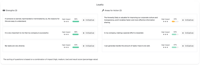
These are high-impact and high-score areas. Celebrate and protect them.
These are low-score , high-influence items. Improving them is likely to reduce turnover.
Interestingly, while this question is obviously not part of a scientifically validated questionnaire (as it is too specific to our internals), as an immediate and concrete next step the “Honestly Daily” meeting was discontinued.
🛠️ How to Create the Chart (the Right Way)
1. Choose a Construct to Focus On
For example,- Engagement ,
- Loyalty ,
- Turnover Intention ,
- Psychological Safety , or
- Inclusion
2. Use the Honestly Engagement Questionnaire
The Honestly Questionnaire is a scientifically validated instrument, developed in cooperation with Freie Universität Berlin. It includes 67 questions grouped into reliable factors and sub-factors based on the Job Demands–Resources (JD-R) Model. ➤ Learn more here: Factors and Sub-Factors of the Honestly Engagement Questionnaire3. Pick Scientifically Validated Target Questions
Each construct in the questionnaire is already backed by well-defined items. For example, to predict Turnover Intention , select the following three questions:- _“The idea of starting in a new position in a different company is appealing to me.”
- _“If it were up to me, I would still work in my current company in five years.”
- _“I would like to stay in this company for as long as possible.”
- Ranked single select
- Smiley faces
- Stars
4. Run the Chart
Our system will:- Compute Pearson’s R for each remaining question compared to your target
- Filter out any question with correlation < 0.1
-
Group remaining questions into:
- ✅ Strengths : Correlation ≥ 0.1 AND score ≥ 75%
- ⚠️ Areas of Action : Correlation ≥ 0.1 AND score < 75%
5. Interpret the Output
Focus on improving action fields to maximize impact on your outcome. Reinforce strengths to maintain performance.🧠 Example Scenario
Case: Team Manager aims to reduce turnover.- Sets the three Turnover Intention items as target
- Chart reveals
- ✅ Strength : “My manager trusts me” (score: 89%, correlation: 0.74)
- ⚠️ Area of Action : “I have the tools I need to do my job” (score: 61%, correlation: 0.79)
💡 Pro Tips
- Don’t chase low scores blindly. Focus on items that have a strong statistical relevance for your chosen construct.
- Repeat over time. What drives turnover today may not be the same next quarter.
- Use results in leadership workshops to co-create high-impact actions with team leads or departments.
- Be aware! Correlation does not equal causation. Try to understand why scores are flagged as relevant to determine the right course of action.
📚 Learn More
- Factors and Sub-Factors of the Honestly Questionnaire
- What is Pearson’s R? (Layman’s Guide)
- Fun facts: Random correlations
Related articles
- How can I create an initiative based on my surveys and use AI-powered recommendations?
- Factors and Sub-Factors of the Validated Honestly Engagement Questionnaire
- What is a dashboard and how do I create a new one?
- Why Defining Clear Actions from Employee Surveys is Crucial
- How is AI used in our software?