

What is the Bubble Chart?
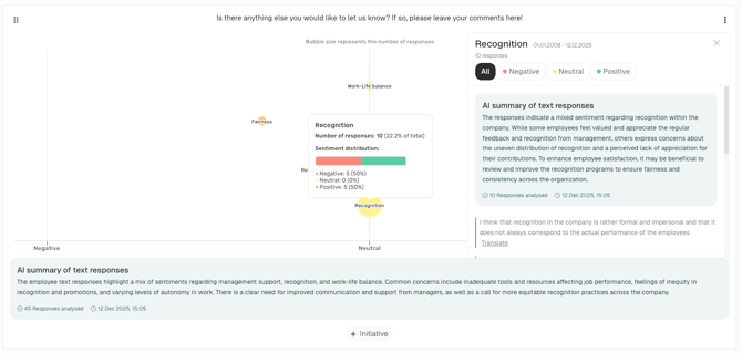
The Bubble Chart is an interactive visualization that helps you understand how employees feel about different topics in their open text survey responses.Each bubble represents a topic, showing both how many responses were received and the average sentiment (negative, neutral, or positive).
- Bubble size → number of responses for that topic
- Bubble color → overall sentiment (green = positive, yellow = neutral, red = negative)
- Bubble position → sentiment placement from negative (left) to positive (right)
How can I create this chart?
Creation (Admin/Manager/Analyst)-
In the side menu

-
Go back to your dashboard

-
Select the Bubble Chart
- Now choose your questions – in this case, the open text fields that should be visualized as a Bubble Chart.
-
Click “Save”.

After creation and for dashboard users (Admin/Manager/Analyst/Report Viewer)
- Open the Bubble Chart in your dashboard.
- Hover over bubbles to see quick statistics.
-
Click on a bubble to drill down into individual employee responses.
- All available responses for that topic are shown.
- An AI-generated summary is generated for each drill down
- Responses are displayed according to user permissions and survey anonymity settings.
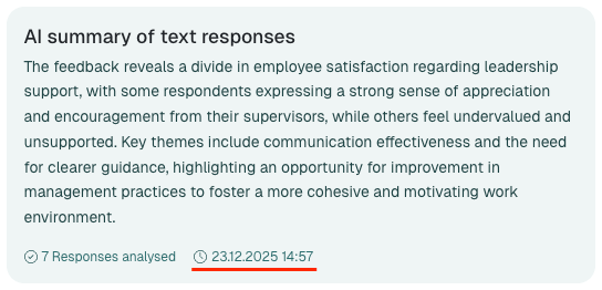
- Read the AI-generated summary below the chart for a quick overview of all feedback included.
Each AI-generated summary remains available for 8 weeks from the moment you first open it. If new responses are added during this period, the summary will be refreshed automatically.
The summary is personalized and can differ from user to user based on their permissions and survey settings.
A note at the bottom of the AI summary shows the date and time when it was generated.
Why is this useful?
- Identify sentiment patterns : Quickly see which areas employees feel positively or negatively about.
- Understand the “why” : Drill down into real employee comments.
- Prioritize actions : Focus on the topics with the strongest negative sentiment or the most responses.
Permissions & Anonymity
- Anonymity safeguard: The highest text anonymity threshold of any survey related to questions included in the chart is applied to the entire chart.
- Permissions safeguard: Only responses that the viewing user has permission to see are included.
Why is my Bubble Chart empty?
Each bubble is a topic, and the chart only includes open text responses that are already assigned to a topic. Responses that have not been categorised yet do not appear in the chart at all. Responses are assigned to topics in one of two ways:- Automatically: If an admin has switched on the Automatic Topic Analysis tab in the settings, topic analysis starts by itself as soon as a survey reaches its end date. For recurring surveys, it runs at the end of every cycle. The setting applies to all standard surveys in your account.
- Manually: In the side menu under Topics, select the survey and the time period, then click Start AI assistant next to the question — or assign the responses by hand. How this works is explained here.
Automatic Topic Analysis requires consent to Microsoft as a subprocessor, because the text responses are sent to Microsoft (Azure OpenAI) for analysis.
The chart shows the same anonymity message whether topics are missing or the threshold is not met, so check the topics first.
Example Use Cases
- Post-change monitoring : After a new policy or initiative, check how employees react.
- Trend tracking : Compare work-life balance sentiment before and after implementing remote work.
- Spotting issues early : Detect emerging concerns in areas like fairness or tools & resources.
👉 Tip: Combine the Bubble Chart insights with your initiative tracking. When you make changes based on feedback, check the chart again to see if sentiment improves.