

Which columns the file contains
- Date — the day the feedback was given
- Survey — the name of the survey
- HonestlyId — a unique ID for each individual piece of feedback
- one column per survey property, for example location or department
- then one column per question, headed with the question text and the question ID in brackets
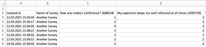
The three fixed column headings Date, Survey and HonestlyId are always in English, whatever the language of your account. The question texts appear in the language you created the export in.
What a question column contains
That depends on the question type:
A few specifics:
- If someone skipped a question, the cell stays empty.
- For a multiple select, every chosen option appears in the same cell, separated by commas.
- If an answer option has a free text field (“Other”), the cell shows the name of the option followed by the entered text in brackets.
1 is the best answer
For rating scales and smiley questions, the numbers in the export work like school grades: 1 is the best answer, and the highest number is the worst. That highest number comes from the number of answer options on the question, not from a scale setting in your account. A question with 11 answer options therefore produces values from 1 to 11, and a question with 5 options values from 1 to 5 — even if your dashboards display results on a scale from 0 to 10. Two question types run the other way round:- Star questions: 5 is the best rating and 1 the worst.
- NPS questions: 10 is the best rating and 0 the worst.
Why the export does not match the dashboard
Both numbers are correct — they show the same result in two different directions:- The export contains the rank of the answer option, where 1 is the best answer.
- The dashboard turns that rank around and converts it to the display scale. There, the higher value is the better one.
Working out the dashboard value yourself
You need two figures: the average of the question column from Excel, and the number of answer options on that question (which is also the worst possible rank). Step 1 — calculate the percentage:percentage = (number of answer options − column average) ÷ (number of answer options − 1) × 100
Step 2 — convert it to your display scale:
display value = worst value + percentage ÷ 100 × (best value − worst value)
Worst value and Best value are the ones set for the custom scale under Settings → Results display. If your dashboard shows percentages, step 1 is all you need.
Example: a question with 11 answer options, a column average of 3.36, and a display scale from 0 to 10.
- Step 1: (11 − 3.36) ÷ 10 × 100 = 76.4%
- Step 2: 0 + 76.4 ÷ 100 × (10 − 0) = 7.6
This conversion does not apply to star and NPS questions. Stars count straight upwards, and NPS is always calculated as a value from −100 to +100 from the share of promoters and detractors.