If you use the Pulse surveys:
In the "Dashboards" section, you can select one of 3 preset dashboards:
- Weekly Pulse
- ENPS
- Open questions
The individual dashboards show information gathered by the Weekly/Monthly Pulse questionnaire.
Which dashboard shows which results?
Weekly/Monthly Pulse dashboard
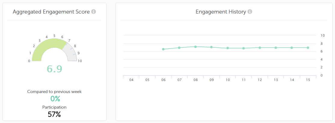
This dashboard shows the Engagement Score which is the average of the 9 metrics which make up this survey. The Engagement chart shows the total result including a comparison to the previous week and the Engagement History chart shows the results of the last calendar weeks.
Secondly, the results of the themes discussed in the survey are displayed using 9 metrics and a varied number of submetrics.
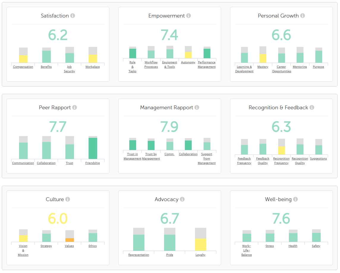
The 9 metrics and their submetrics:
- Satisfaction: Compensation, Benefits, Job Security and Workplace.
- Empowerment: Role & Tasks, Workflow Processes, Equipment & Tools, Autonomy and Performance Management.
- Personal Growth: Learning & Development, Mastery, Career Opportunities, Mentoring and Purpose.
- Peer Rapport: Communication, Collaboration, Trust and Friendship.
- Management Rapport: Trust in Management, Trust by Management, Communication, Collaboration, Support from Management.
- Recognition & Feedback: Feedback Frequency, Feedback Quality, Recognition Frequency, Recognition Quality and Suggestions.
- Culture: Vision & Mission, Communication of Strategy, Values and Ethics & Responsibility.
- Advocacy: Championship, Pride and Commitment.
- Wellbeing: Work-Life-Balance, Stress, Health and Safety.
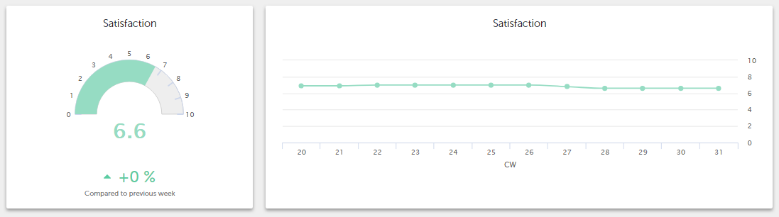
If you place your cursor above a submetric, its individual result is shown. The total result for the metric is displayed above the chart in figures and the colour of these figures indicates how good or bad the total feedback for this metric was.
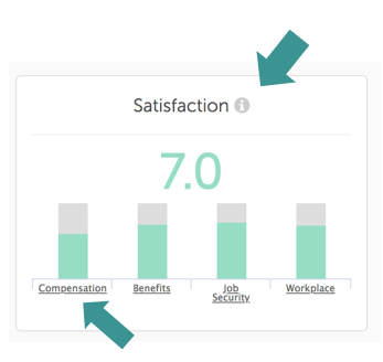
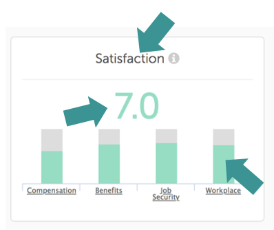
More detailed results - the Deep Dive:
To see more details about the individual metrics and submetrics, click on either the chart's title, the total score or any of the columns:
The Deep Dive will appear. Just as with the Engagement Score, the diagram on the left shows the total score and the line chart on the right shows you how the score has changed over the last weeks or months (depending on which kind of Pulse Survey you use).
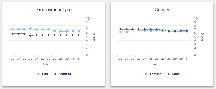
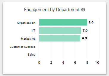
This metric's results in the last weeks or months will be displayed according to any groups you have created like this:
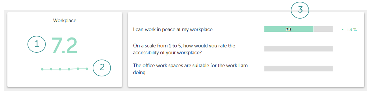
Then you will see the results for each individual submetric like this:
- the current total score
- a line chart showing the scores in the last weeks or months
- the results of each individual question in this submetric plus whether it has improved/worsened since the last period.
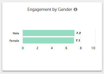
If your employees have been divided into goups, you will see the accumulated results of these groups such as Department or Gender:
eNPS dashboard
In this dashboard, the eNPS (Employee NPS) results of the survey are displayed. These are shown in months and not weeks as NPS questions are asked just once, at the start of each month.
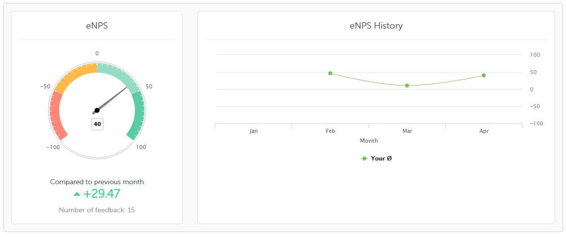
The eNPS gauge shows the total result with a comparison to the previous month and the eNPS History line chart shows the results of the last months. Your average is shown here compared to the company's average.
Open Questions dashboard
All answers to the open questions of the Weekly Pulse Survey are shown here.
Can I choose to display results for particular periods of time in the dashboards?
Both the ENPS and Open Question dashboards can be displayed monthly. However, this is not the case with the Weekly/Monthly Pulse dashboard. With both of these, it will depend on your chosen settings.
If you have created your own surveys, you will of course have the possibility to create dashboards for these too.