
In the Analysis section, you can choose which results to display by using a filter.
On the left, you select the feedback form and survey and on the right, you can choose the days of the week and the period of time which should be applied to the filter.
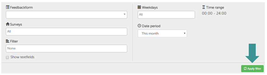
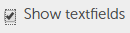
You can also choose to display text fields by clicking this box.
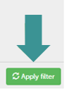
Once you have adjusted all of the settings, click "Apply filter" to see the results.
All the charts, according to question type:
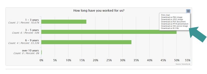
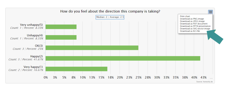
Single select analysis
Single select results are displayed as bar charts. The horizontal axis shows the percentage and the vertical axis shows all the possible answers. Count shows how many people chose each answer and Percent shows the percentage that chose this answer out of all possible answers.
By clicking the symbol in the top right corner of the chart, you can choose to print the data or download it in various ways for example as a PNG, JPG, XLS etc.
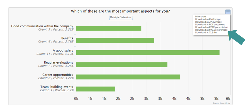
Multi select analysis
Multi select results are also displayed as bar charts.
Each of the possible answers can be seen with Count again showing how many people chose each answer and Percent showing the percentage that chose this answer out of all possible answers.
The only real difference between this and the single select analysis is the title "Multi Select" above the chart.
By clicking the symbol in the top right corner of the chart, you can choose to print the data or download it in various ways for example as a PNG, JPG, XLS etc.
Text field analysis
If you clicked the "Show textfields" box, this feedback will appear as a list.
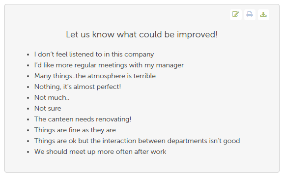
In the top right corner you can choose to edit, print or download the data as a PDF.

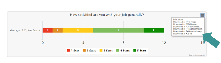
Five Star analysis
Five star results are displayed as stacked bar charts.
Smiley analysis
Smiley results are displayed as bar charts.
The Count results are shown for each individual smiley so you can see exactly how many people clicked on which smiley. Percent shows the percentage that chose this answer out of all possible answers.
Underneath the question, both the average and median are shown.
Here you can also use the menu in the top right corner of the chart to either print the data or download it in various ways.
NPS analysis
Net Promoter Score (NPS) results are displayed in the following ways:
- a gauge
- 2 bar charts
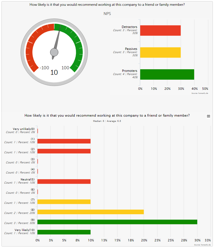
The gauge shows the tendency from -100 to 100, so how many of those who participated in the survey were either promoters or detractors.
The total amount of detractors, passives and promoters is displayed in the chart to the right of the gauge.
The NPS results are displayed in detail in the second bar chart, showing the reults in a scale from 0 to 10.