> ## Documentation Index
> Fetch the complete documentation index at: https://help.honestly.com/llms.txt
> Use this file to discover all available pages before exploring further.
# How can I compare the results of different employee groups in my dashboard?
> How do you use Honestly to compare the results of different employee groups? Learn the steps to create comparison charts and explore various options for individual analysis.
### **What is a dashboard?**
In this section, you can decide which survey results are important to you and which aren't by creating **personalised dashboards**. Either create one for each feedback form or combine various forms on one dashboard.
### **How do I create a new dashboard?**
First click on "Add dashboard" (top right). A window will appear where you can give the dashboard a name and choose which survey to use as its information source.

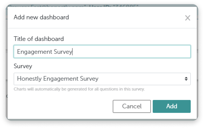 The charts are then generated automatically. They are based on the survey and are created in the same order as the survey.
**Tip:** You are also free not to select a survey; you will then receive an empty dashboard. You can then customise this yourself. For example, you can add different questions from different surveys here.
###
### **Comparison of Data**
It is possible to compare the results of several employee groups for example "Location" or "Department" in the dashboard.
All results can also be compared to the company's benchmark as shown below.
**Displaying data from Smiley questions:**
The charts are then generated automatically. They are based on the survey and are created in the same order as the survey.
**Tip:** You are also free not to select a survey; you will then receive an empty dashboard. You can then customise this yourself. For example, you can add different questions from different surveys here.
###
### **Comparison of Data**
It is possible to compare the results of several employee groups for example "Location" or "Department" in the dashboard.
All results can also be compared to the company's benchmark as shown below.
**Displaying data from Smiley questions:**
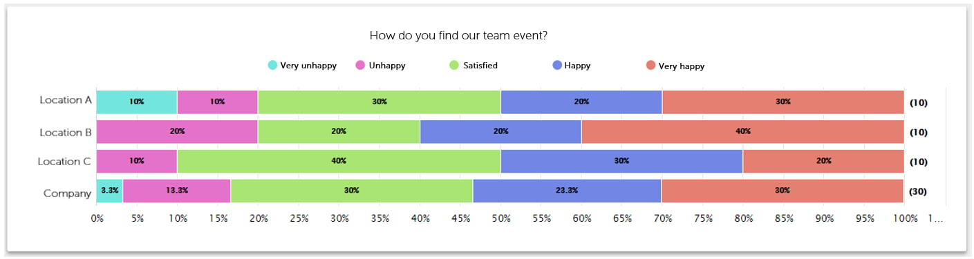 To create this kind of chart, just follow these steps when creating a new chart on your dashboard:
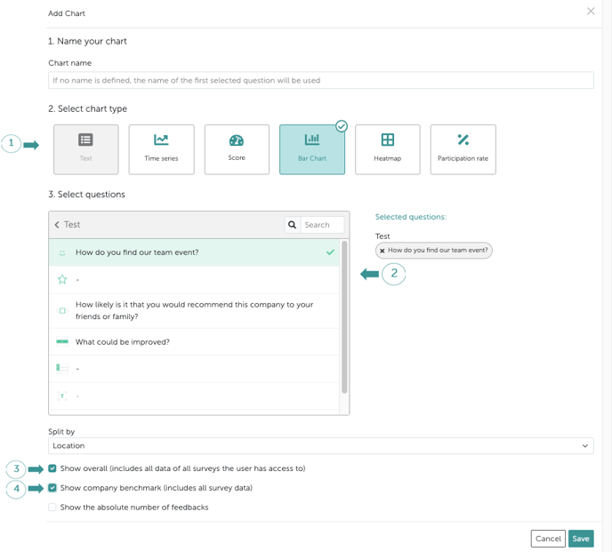 Then click "**Save** ".
**Tip:** You can also select several questions from the same question category to create your own evaluation categories.
Example: My survey has 16 questions, but the first 4 questions are counted as satisfaction, then you can mark these 4 and display them as one chart.
**Displaying data from "Single/Multiple selection" questions:**
Then click "**Save** ".
**Tip:** You can also select several questions from the same question category to create your own evaluation categories.
Example: My survey has 16 questions, but the first 4 questions are counted as satisfaction, then you can mark these 4 and display them as one chart.
**Displaying data from "Single/Multiple selection" questions:**
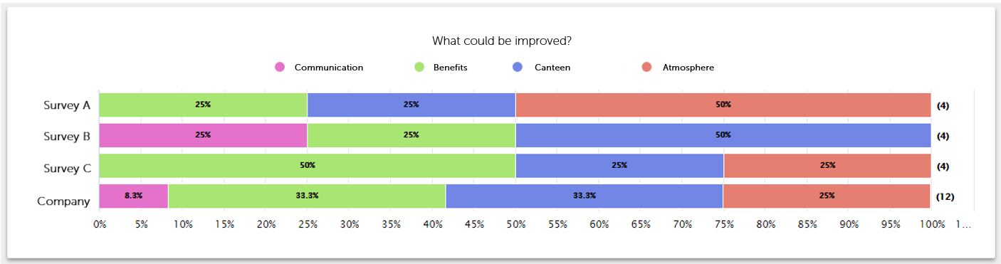 To create this kind of chart, just follow these steps when creating a new chart on your dashboard:

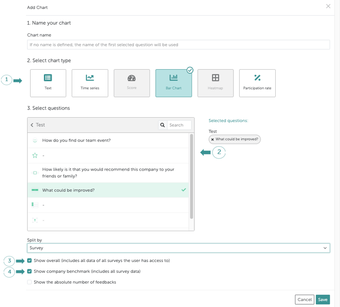 Then click "**Save** ".
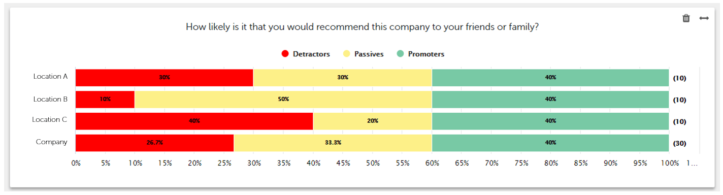
**Displaying data from NPS questions:**
Here you can see the comparison of all groups' NPS results. These are divided into "Detractors", Passives" and "Promoters" in your employee groups:
Then click "**Save** ".
**Displaying data from NPS questions:**
Here you can see the comparison of all groups' NPS results. These are divided into "Detractors", Passives" and "Promoters" in your employee groups:
 To create this kind of chart, just follow these steps when creating a new chart on your dashboard:
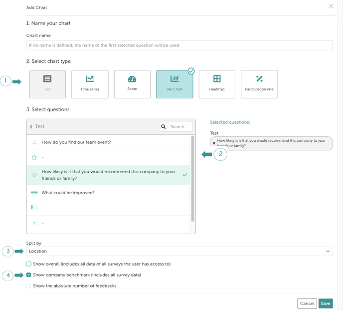 Then click "**Save** ".
**Comparing the total NPS results:**
See the total results of your NPS results like this:
Then click "**Save** ".
**Comparing the total NPS results:**
See the total results of your NPS results like this:
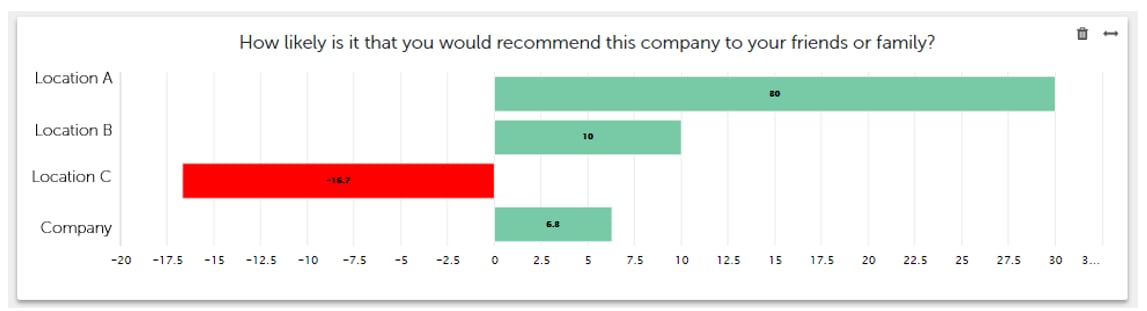 To see your results displayed in this way, just follow these steps:
 Unlike before, now select the **"Score Chart"** instead of the Bar Chart.
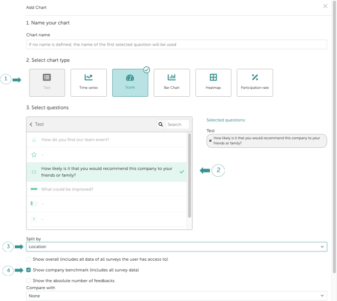 Then click "**Save** ".
**Tip:** These articles might also be interesting:
[What is a dashboard and how do I create a new one?](/help/dashboard/create-dashboard)
[How do I edit an existing dashboard?](/help/dashboard/edit-dashboard)
Then click "**Save** ".
**Tip:** These articles might also be interesting:
[What is a dashboard and how do I create a new one?](/help/dashboard/create-dashboard)
[How do I edit an existing dashboard?](/help/dashboard/edit-dashboard)